For as long as we can remember the map of our world looked like this:
http://geology.com/world/world-map.shtml
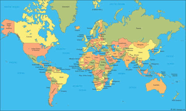
This is the map represented by the Mercator projection created hundreds of years ago. In recent years, however, the Mercator projection has been considered to be misleading. For example, Greenland and the continent of Africa appear to be roughly the same size when it actuality Africa is over 10 times the size of Greenland. As a result, the Gall-Peters projection has been considered a more reliable representation of the world. You may notice it is quite different than what we are used to:

The Boston school district recently introduced this new map as the standard and needless to say students were pretty shocked. Joanna Walters (2017) from the Guardian reported on the new map rollout noting some of the most obvious differences:
The USA was small. Europe too had suddenly shrunk. Africa and South America appeared narrower but also much larger than usual. And what had happened to Alaska?
Walters believes the new map standard will lead to a paradigm shift and a step towards decolonizing the curriculum. She explains:
The result goes a long way to rewriting the historical and sociopolitical message of the Mercator map, which exaggerates the size of imperialist powers.
“This is the start of a three-year effort to decolonize the curriculum in our public schools,” said Colin Rose, assistant superintendent of opportunity and achievement gaps for Boston public schools.
I believe it would be a powerful exercise to have students compare the two maps and analyze the differences. Integration of a new and more reliable map standard is truly important step in working towards a socially just curriculum.
